The first things I learned about CSS were the box model and positioning which I would like to describe in this article.
Short history
There are many ways to create a layout with CSS. But at the beginning of the internet in the early nineties web pages did not really had a design or layout. Web designers started to use tables or framesets to layout webpages. But both techniques had disadvantages and problems in terms of accessibility and usability.
Tables
Using tables to layout pages seems logical because it was easy to divide the content into columns and create grids. However there are a lot of things why using tables for page layouts is a bad idea:
- No semantic markup. Tables have a different purpose: Displaying tabular/2D data
- Content and design are not separated
- Negatively affect screen readers and text browsers
- Making a table layout responsive is hard
- More code and harder to maintain (often code is split into chunks of different files)
- Back then slower loading and rendering because of more code
Frames
Framesets allow to show content in different areas of a page. Certain areas can always be visible (e.g. the navigation) while other areas can change (e.g. when clicking a link in the navigation to change the main area).
Frames conflict with the original idea of the web. The URL does not contain the complete information of the displayed content. The URL shows the frameset not the originally displayed page. Like with tables it is also hard to make them responsive.
The website "The History of the Web" from Jay Hoffmann has an interesting article about Table and Frame layouts.
Why CSS?
I used frames and tables for a short time. Until I discovered CSS.
CSS (Cascading Style Sheets) is a style sheet language. It allows authors and users to perform formatting on their structured documents, e.g. HTML or XML documents and applications. With CSS the content and the presentation of a web page are separated and it is easier to create and maintain web pages.
Advantages of using CSS:
- Presentation is separated from structure
- Easier to maintain the whole website layout
- Avoids duplication because with CSS the same appearance can be defined for different elements
Adding style to a document
A minimal HTML document can look like this:
<!DOCTYPE html>
<html lang="en">
  <head>
    <meta charset="utf-8" />

    <title>How to start with CSS</title>

    <meta name="viewport" content="width=device-width, initial-scale=1" />
  </head>
  <body>
    <p>Hello, CSS!</p>
  </body>
</html>
CSS rules are used to format documents. A CSS rule has a selector and declarations. Declarations consist of properties and values.
The simplest selector consists of an assignment to an HTML element. In the following exampel p is the selector. It selects all paragraph elements in the document. The property color with the value limegreen is used to make the text of all paragraphs appear in limegreen.
p {
  color: limegreen;
}
Inline
CSS rule declarations can be inserted directly in the HTML tag. This is called inline style. This may be useful if a single area on a website should be formatted. Using this method too much can lead to confusion, is hard to maintain and error-prone. With the following inline style the text "Hello, CSS!" appears in the color "limegreen". After the semicolon more declarations can be added. A selector is not necessary because the inline style is already attached to an element.
<p style="color: limegreen;">Hello, CSS!</p>
Document Head (Internal)
Another option is to add the styles in the head of the HTML document. The big advantage over inline styles is that the style can be defined once and is applied for the entire document.
<!DOCTYPE html>
<html lang="en">
  <head>
    <meta charset="utf-8" />
    <title>How to start with CSS</title>
    <meta name="viewport" content="width=device-width, initial-scale=1" />

    <style>
      p {
        color: limegreen;
      }
    </style>

  </head>
  <body>
    <p>Hello, CSS!</p>
  </body>
</html>
Linked Stylesheet with external file (External)
The most common way is to use an external file. Therefore different pages can use a common stylesheet. All rules are concentrated in one place and layout changes for the whole website can be made easily. The stylesheet will also be cached which makes loading faster on the following pages. The CSS rules are inserted into this external file.
<!DOCTYPE html>
<html lang="en">
  <head>
    <meta charset="utf-8" />
    <title>How to start with CSS</title>
    <meta name="viewport" content="width=device-width, initial-scale=1" />

    <link rel="stylesheet" type="text/css href="path/to/style.css" />

  </head>
  <body>
    <p>Hello, CSS!</p>
  </body>
</html>
/* style.css */
p {
  color: limegreen;
}
Elements
There are many semantic elements to structure a page, e.g. header, article or footer. There is also the element div (Divider) which is used as a generic container to group and style content. By default, there is no effect on content or layout.
Keep in mind that section is not a replacement for div.
Box Model
To understand web layouts it is important to know two things: the box model and the element types (e. g. block and inline).
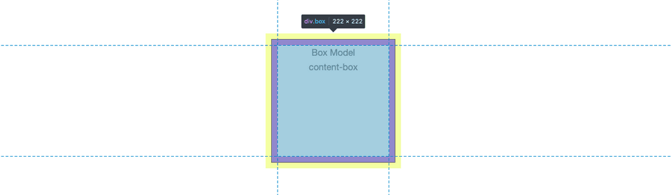
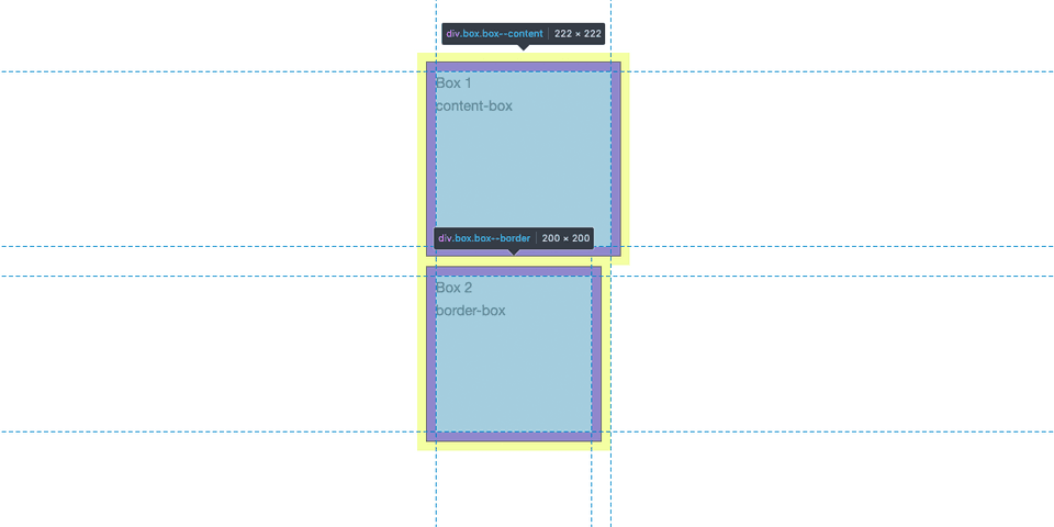
In CSS all elements are shaped like boxes. Each box could be described with properties like width, height, margin, padding, border or position. By default the full width and height of a box does not calculate form all values. Only the content defines the width or height. For example if an element had a width of 200 pixels, a margin of 10 pixels, a padding of 10 pixels and a border of 1 pixel the box is 222 pixels broad because the margin is outside of the box. Padding and border are included.
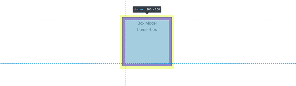
This behavior can be changed with the property box-sizing, the default value is content-box. To make the example box 200 pixels broad we can set the value to border-box. This will result in a box that has 200 pixels. The padding and the border are now included in the box.
Another important detail is that the margins of boxes collapse. This means that the bigger margin is the margin between the boxes and not both margins together. So if two boxes each have a margin of 10 pixels, the margin between them is not 20 pixels, instead it is 10 pixels because they collapse.
In addition, the type of an element is decisive for the behavior. Elements have a specific type by default. Normally elements had the type block or inline. But there are more types like inline-block, table, list-item, flex or grid.
Block elements have an automatic line break before and after itself. They fit to the available space of the parent element.
Inline elements do not break the line. They stay in the text flow and are only as wide as the content. Setting the properties width, height or margin does not influence inline elements.
It is possible to change the default type of an element with the property display. For example a anchor tag is an inline element by default. With display: block; it can be displayed as a block element.
Positioning
There is another property that is important for layouts, namely position. The property position handles the behavior of elements and subsequent elements and the position of them. There are five kinds of positions: static, relative, absolute, fixed and sticky.
With the properties "top", "bottom", "left" and "right" the horizontal and vertical position is set. This properties do not work for static positioned elements.
Static
The default value is static. This means that the elements are in the document flow. One element is displayed after the other like they are noted in the source code. If elements are positioned static and are inline or inline-block elements, they are arranged side by side till the end of the line.
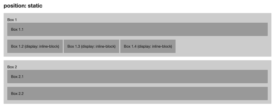
In contrast to the other types of positioning, static does not create a new stacking context. The stacking context is a concept to move elements on the z-axis relative to the user. The order of elements is defined with the property z-index.
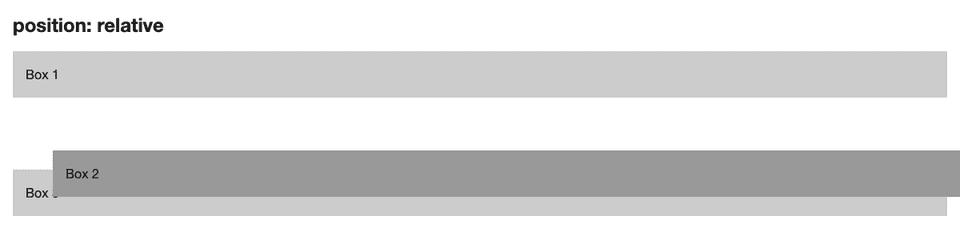
Relative
Relative positioned elements are similar to static elements but they can be shift horizontally and vertically relative from their original position in the document flow. Elements with relative positioning do not affect other elements, but they create a new stacking context.
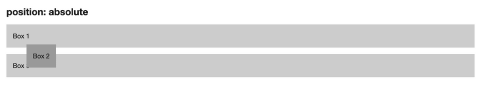
Absolute
An absolute positioned element can also be moved horizontally and vertically but it is positioned relative to its next positioned parent element.
An absolute positioned element is removed from the document flow and creats a new stacking context. Subsequent elements move to the original position of the absolute positioned element.
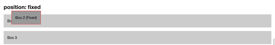
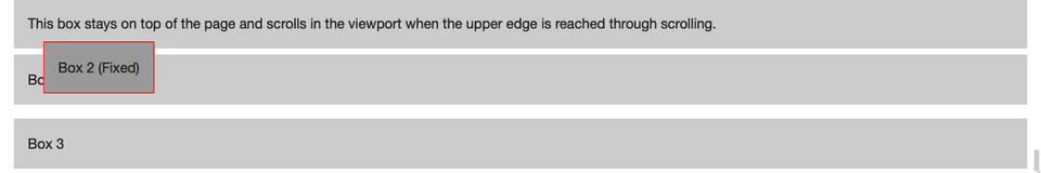
Fixed
Fixed elements are similar to absolute positioned elements, they are removed from the document flow but the positioning is relative to the browser window. Elements with fixed position do not scroll. They keep their position on the screen.
Sticky
There is another property for positioning called sticky. The specification is still in progress (working draft) but has already good browser support.
Sticky elements are similar to relative elements. The element scrolls until the edges reach a specified point (via "top", "right", "bottom" or "left"). When this point is reached, the element is fixed and stops scrolling. With sticky positioning it is possible to create a navigation bar that scrolls with the content until a defined point and then stays at the top of the viewport.
Conclusion
I hope this article gave a little insight into the world of CSS and helps you get started. If you have any questions don’t hestiate to ask me.
Sources
- My own first bachelor thesis from 2013 called "Web Layouts: The evolution of web layouts and the new possibilities with CSS3"
- Kai Laborenz, CSS: Das umfassende Handbuch, Galileo Computing
- MDN - Learn web evelopment: Positioning
- The History of the Web
Side note
When I started building website I wondered how I can have an area like the navigation on every page without having to copy the code part every time (and of course not always having to change every page when a menu item changes).
Most of the time, the website is divided into parts that can be reused. There are several ways to achieve this. Possible solutions are template engines (e.g. Handlebars) with build tools or server-side rendering (e.g. with PHP include/require). If you are interested in such an article send me a tweet.