Component based designs and layouts are great to work with. When creating reusable web components, care must be taken to ensure that they adapt to the available space. Media queries are used for the entire layout of a website or web app. With individual components or elements, however, media queries are not optimal, since you often do not know exactly how much space is available for the component. That’s what container queries are for.
Depending on the target audience maybe it is possible to use Container Queries today (browser support is about 82 % world wide). But that my not be enough and support for more browsers is needed.
Instead of Container Queries the support for the ResizeObserver interface is much better (94.5 %). Since Web Components do not work without JavaScript anyway, we can use the ResizeObserver interface.
Let’s start with a basic card Web Component that uses Shadow DOM and displays an image, a heading and some text. Three slots are used for those parts.
const template = document.createElement('template');
template.innerHTML = `
  <style>
    :host {
      display: block;
      padding: 1rem;
      overflow: hidden;

      border: 2px solid #cccccc;
      border-radius: 8px;
    }

    :host([hidden]) {
      display: none;
    }

    slot[name="title"]::slotted(*) {
      margin-top: 0;
    }

    slot[name="text"]::slotted(*) {
      margin-bottom: 0;
    }

    slot[name="image"] {
      display: block;
      margin-bottom: 1em;
    }

    slot[name="image"]::slotted(img) {
      display: block;
      max-width: 100%;
    }
  </style>
  <div class="bhdzllr-card js-container">
    <slot name="image"></slot>
    <slot name="title"></slot>
    <slot name="text"></slot>
  </div>
`;

class Card extends HTMLElement {

  constructor() {
    super();

    this.attachShadow({ mode: 'open' });
    this.shadowRoot.appendChild(template.content.cloneNode(true));
  }

}

customElements.define('bhdzllr-card', Card);
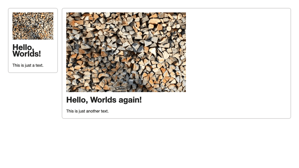
The code above creates a custom element bhdzllr-card. By now this element displays all three parts after another no matter how much space is on the screen or in the containing element. In the markup the component can be used multiple times.
Now we create a two-column layout with one element each. One column gets a fixed width of 200 pixels and the other takes up the rest of the space.
<div class="grid">
<div>
<bhdzllr-card>
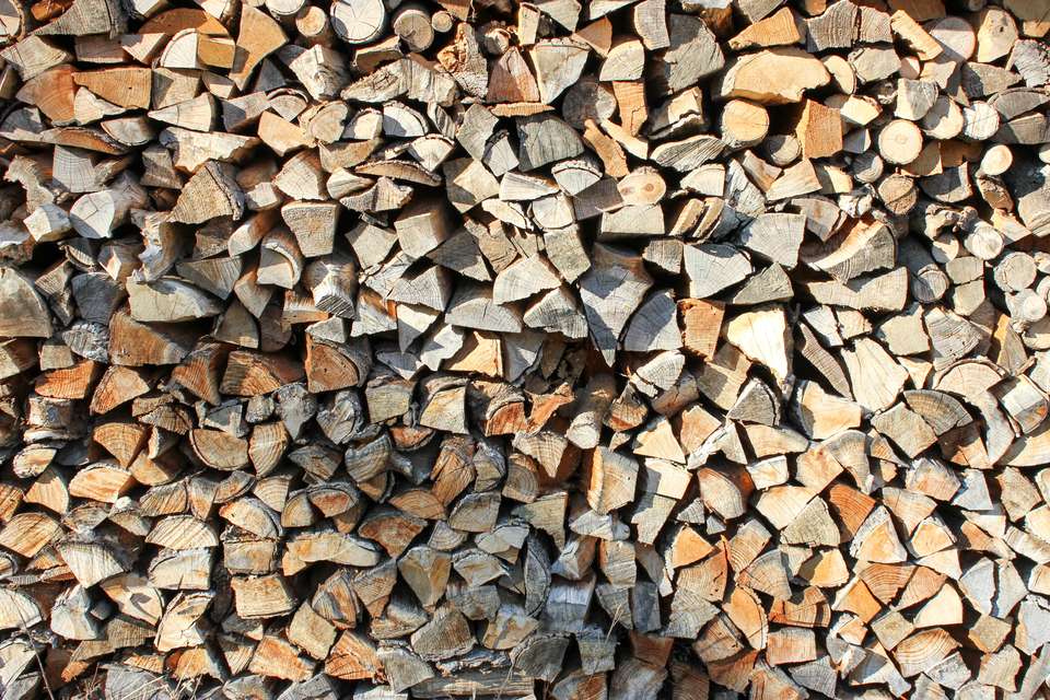
<img slot="image" src="demo-image-480.jpg" alt="Brown and black firewood stacked" />
<h1 slot="title">Hello, Worlds!</h1>
<p slot="text">This is just a text.</p>
</bhdzllr-card>
</div>
<div>
<bhdzllr-card>
<img slot="image" src="demo-image-480.jpg" alt="Brown and black firewood stacked" />
<h1 slot="title">Hello, Worlds again!</h1>
<p slot="text">This is just another text.</p>
</bhdzllr-card>
</div>
</div>
.grid {
  display: grid;
  grid-template-columns: 200px 1fr;
  grid-gap: 1rem;
}
Now we want the card component display the text next to the image if there is enough space, we do this with a Resize Observer by watching for size changes on the root element (host) of the component. If the size changes and is beyond a specific point we add a CSS class to our containing element in the component to add different styles. The observer is only watching the host element, so we can always pass the first element of the entries array to the update method to apply the classes based on the container width.
class Card extends HTMLElement {

  static get breakPoint() {
    return 250;
  }

  constructor() {
    super();

    this.attachShadow({ mode: 'open' });
    this.shadowRoot.appendChild(template.content.cloneNode(true));

    this.el = this.shadowRoot.getRootNode().host;
    this.container = this.shadowRoot.querySelector('.js-container');
    this.resizeObserver = new ResizeObserver((entries) => this.updateContainer(entries[0]));
  }

  connectedCallback() {
    this.resizeObserver.observe(this.el);
  }

  updateContainer(entry) {
    if (
      entry.contentBoxSize[0].inlineSize > Card.breakPoint
      && !this.container.classList.contains('bhdzllr-card--lg')
    ) {
      this.container.classList.add('bhdzllr-card--lg');
    } else if (
      entry.contentBoxSize[0].inlineSize <= Card.breakPoint
      && this.container.classList.contains('bhdzllr-card--lg')
    ) {
      this.container.classList.remove('bhdzllr-card--lg');
    }
  }

}
The code uses entry.contentBoxSize[0].inlineSize to get the size of the container. Keep in mind it is the content width and therefore excludes border and padding. If the content width is larger than 250 pixels we apply a specific class to the container element inside the component to change the layout of the card. In this case we just float the image to the left.
.bhdzllr-card--lg slot[name="image"] {
  float: left;

  display: block;
  max-width: 25%;
  margin-right: 1em;
  margin-bottom: 0;
  overflow: visible;
}
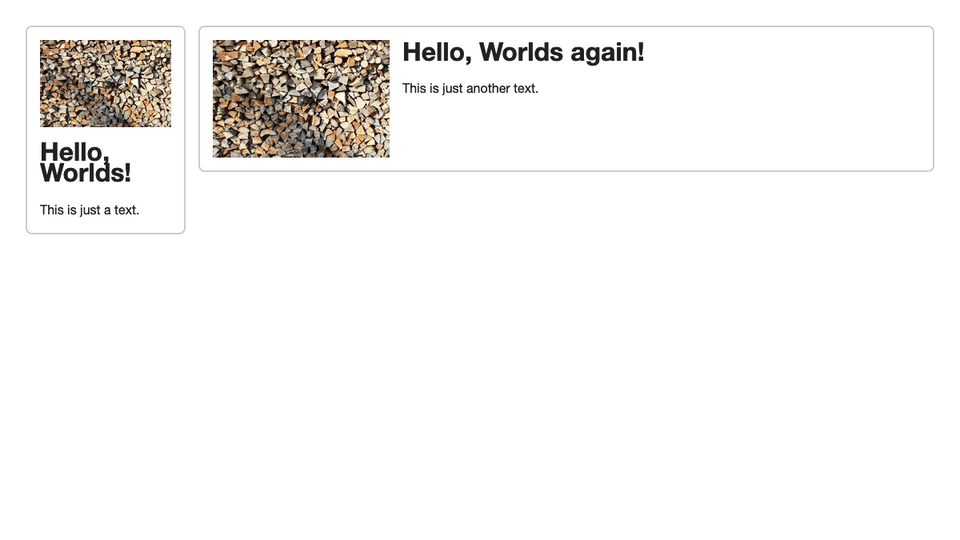
With this technique it’s possible to implement more breakpoints if needed.
The Resize Observer is a good fallback to implement container queries in Web Components if native CSS Container Queries can not be used yet.